
Introduction
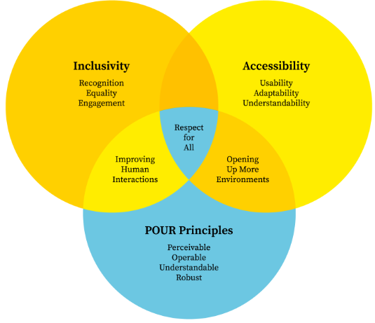
The principles of accessibility and inclusivity in graphic design are the basic foundation of the concept of Universal Design as one of the essential trends aimed at making products and environments accessible to all to the best of their abilities. In its purest sense, graphic design is the art of problem-solving, the communication of ideas through images; yet when a project is readable only by members of a particular demographic or explored by people with flawless eyesight, then the design has merely narrowed its focus and not addressed a situation.
Core Principles of Accessible Design
To create accessible visuals, designers must look beyond aesthetics and focus on how information is perceived and processed.
Read more :
Accessible graphic design
Color Contrast and Color Blindness
Color is an influential emotion tool, and it can be a hindrance. Color vision deficiency (CVD) is found in about 1 in 12 men and 1 in 200 women.
- Contrast Ratios: Standard text should have a contrast ratio of at least 4.5:1 with large text having a contrast ratio of 3:1 with its background.
- Never Trust Color: Color should never be the sole means used to communicate. As an illustration, an error message cannot be red only as well as it should also have an icon or a bold head.
Typography and Legibility
Typography is the vehicle for your message. If the font is too decorative or the spacing is too tight, the vehicle breaks down.
- Font Choice: Sans-serif fonts are generally easier to read on screens, while certain fonts like OpenDyslexic are designed specifically to assist those with dyslexia.
- Hierarchy: Use clear heading levels (H1, H2, H3) so that users—and screen readers—can understand the structure of the information.
Alt-Text and Screen Readers
In digital design, every image must have “Alternative Text.” This is a written description of the image that screen readers read aloud to users with visual impairments.
Pro Tip: Alt-text shouldn’t just say “Dog.” It should be descriptive: “A golden retriever puppy sitting in green grass during a sunset.”

The Pillars of Inclusive Representation
Inclusivity is about “who” is in the design. It is about moving away from stereotypes and creating a visual language where everyone can see themselves reflected.
- Diverse Iconography: Avoid using “man” as the default icon for “person.” Use gender-neutral figures.
- Authentic Photography: Choose stock imagery that shows people of different ages, skin tones, body types, and abilities in active, empowered roles.
- Cultural Sensitivity: Pay attention to colors and forms symbolism in other cultures. Considering that white is a symbol of purity in most cultures of the West, in some areas of Asia, it is considered the color of mourning.
Accessibility Checklist for Designers
| Design Element | Accessibility Requirement | Why It Matters |
| Color | High contrast (WCAG 2.1 AA) | Helps users with low vision and those in bright sunlight. |
| Text | Minimum 16px for web body copy | Reduces eye strain and assists users with age-related vision loss. |
| Buttons | Minimum 44×44 pixel tap target | Essential for users with motor impairments or those using mobile devices. |
| Layout | Linear, logical reading order | Allows screen readers to present information in the correct sequence. |
| Language | Plain language (8th-grade level) | Improves comprehension for non-native speakers and people with cognitive disabilities. |
Designing for Cognitive Diversity
The concept of accessibility is not only about physical sight but also the way the brain handles the information. Users with ADHD, autism, or learning disabilities also enjoy designs that help to minimize the cognitive load.
- White Space: Do not have cluttered layouts. Use a lot of white space to allow the eye to relax and concentrate on the most valuable content.
- Uniform Navigation: Do not rearrange the Home button or alter the menu style across pages. The element of predictability is an important part of accessible UX.
- Restrict Movement: To people with problems of the vestibular apparatus (balance problems), flickering animations or parallax scrolling may result in nausea or seizure. You should always have an option to Reduce Motion.”
Tools for Testing Accessibility
You don’t have to guess if your design is inclusive. There are numerous digital tools available to audit your work:
- Adobe Color: Includes built-in color blindness simulators and contrast checkers.
- Stark: A plugin for Figma and Sketch that automates accessibility checks.
- WAVE (Web Accessibility Evaluation Tool): A browser extension that highlights accessibility errors on live websites.
- WhoCanUse: A website that shows you exactly how your color combinations affect people with various vision types.

The Business Case for Inclusivity
Beyond the ethical obligation, accessibility and inclusivity in graphic design make excellent business sense.
- Expanded Market Reach: When you design for everyone, you don’t exclude the 1 billion people worldwide with disabilities.
- SEO Benefits: Search engines favor accessible websites. Descriptive alt-text and proper header hierarchies help Google index your site more effectively.
- Legal Compliance: In many regions, including the US (ADA) and the EU (EAA), digital accessibility is a legal requirement for businesses.
- Brand Loyalty: Consumers especially Gen Z and Millennials are more likely to support brands that demonstrate a commitment to diversity and social responsibility.
Conclusion
Mastering accessibility and inclusivity in graphic design is a journey of continuous learning. It requires us to step out of our own shoes and see the world through the eyes of others. It challenges us to be more creative, forcing us to find beauty within constraints like a limited color palette that still pops or a minimal layout that communicates clearly. By making accessibility and inclusivity in graphic design your default setting, you are doing more than just making “pretty” pictures; you are building a more equitable world. Designing for the margins doesn’t just help the margins it creates a better, clearer, and more intuitive experience for every single person who interacts with your work.
Want to learn more please click the link below:
Crea8ive Solutions
Frequently Asked Questions (FAQs)
Does accessible design have to look “boring” or “medical”?
Absolutely not. Many of the world’s most beautiful brands use high-contrast palettes and clean typography. Accessibility is about clarity, and clarity is a hallmark of high-end design.
What is the difference between “AA” and “AAA” contrast?
These are levels of the Web Content Accessibility Guidelines (WCAG). “AA” is the standard legal requirement for most businesses, requiring a 4.5:1 ratio. “AAA” is the highest level, requiring a 7:1 ratio, often used for government or educational sites.
How do I write good alt-text for complex infographics?
Don’t try to fit everything in the alt-text tag. Provide a brief summary in the alt-text (e.g., “Infographic showing a 20% rise in global temperatures”) and then provide a full text-based data table or description immediately below the image.
Is sans-serif always better than serif for accessibility?
Not necessarily. While sans-serif is often preferred for low-resolution screens, high-quality serif fonts with distinct letterforms can be very legible. The key is the “x-height” and the spacing between letters.
How can I practice inclusive design if I don’t have a diverse team?
While hiring diverse talent is the best solution, you can also use community audits, participate in “inclusive design” workshops, and use open-source resources like The Microsoft Inclusive Design Toolkit.